Today tvOS Application.
Today application concept is a personalized advertising-based News, Weather, Traffic and Calendar aggregator. The application shows users personalized advertisements based on their habits and preferences and exclusive offers, available only for the users of the Today application.
The inspiration came from a local Toronto news tv channel which has a lot of information on one screen. Today does something similar, but with data relevant to the user, not just generic content. Today is an app a user can launch on the Apple TV or iOS device in the morning and see their entire agenda for the day at a glance. There is no longer a need to go to different apps or websites to see what will be going on particular day. Everything in one place, from Calendars, Traffic to News and Markets.
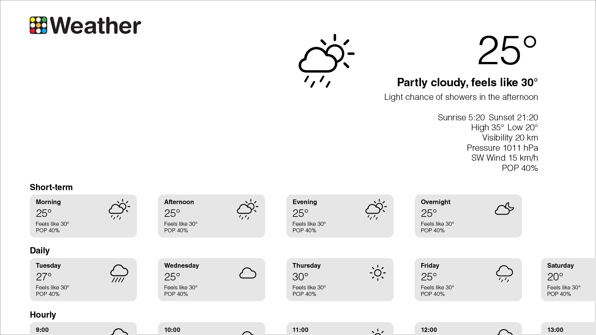
Specifically, the Today app features a main dashboard containing Weather, based on the user location or preferences, Traffic and Transit information, Calendar events, To-do list, News and Markets content from user preferred sources. The user can specify the sources from which they would like to receive the information in the app. The application also shows some light hearted content user can relax to.


The Journey.
The Paper Trail.
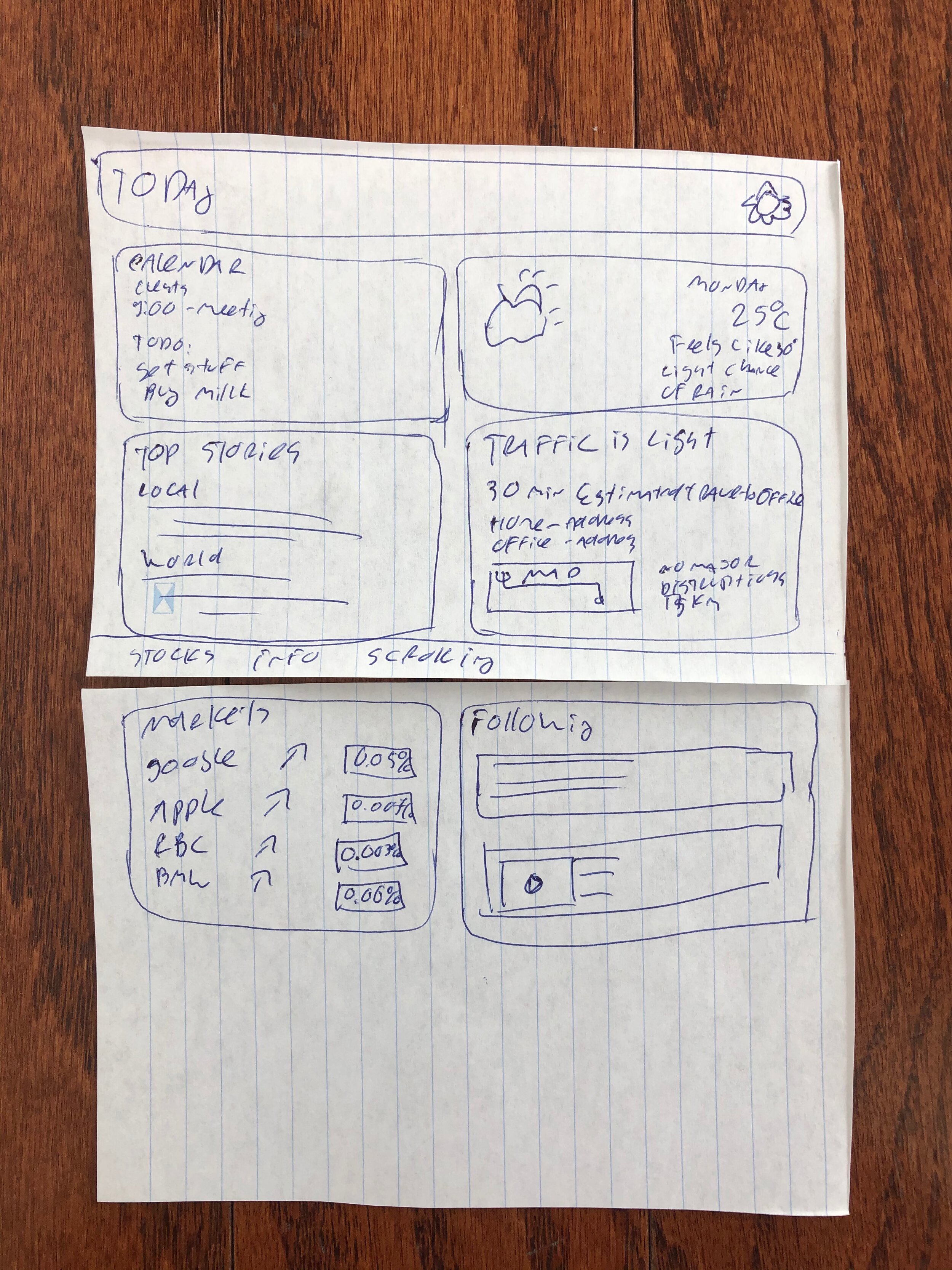
Just like all of my design projects, the Today tvOS app began with the creation of paper prototypes and sketches. This is a critical step, which helps me visualize and layout the interfaces without the complexities of computer design software. The tvOS user experience is drastically different from a handled device. The whole application had to be reimagined from the ground up.


Digital Wireframing.
The Home Screen.
The Today tvOS Application, same as the iOS version, was designed to use very simple navigation. No tabs or complex modal views very used in the design. All the important information is right on the Home Page, everything in one place. The same idea as turning on the morning news, lots of content on one screen. As the user scrolls down, they can see all the relevant content they have picked at a glance, from Traffic, Weather, Stocks to Personalized News and Light Hearted Content Feeds. If the user desires more in-depth information, they can navigate to the Details pages.
Today Details.
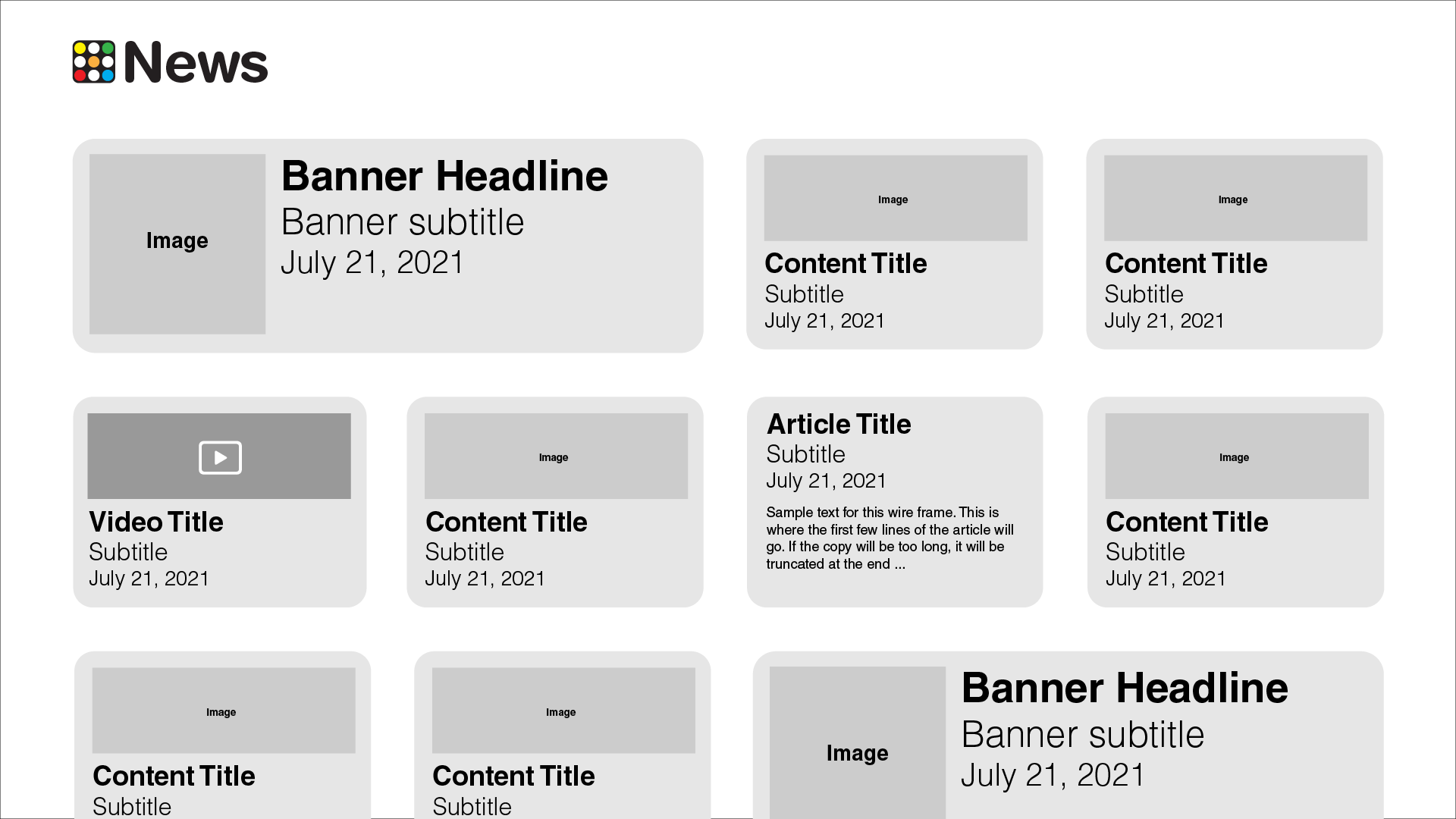
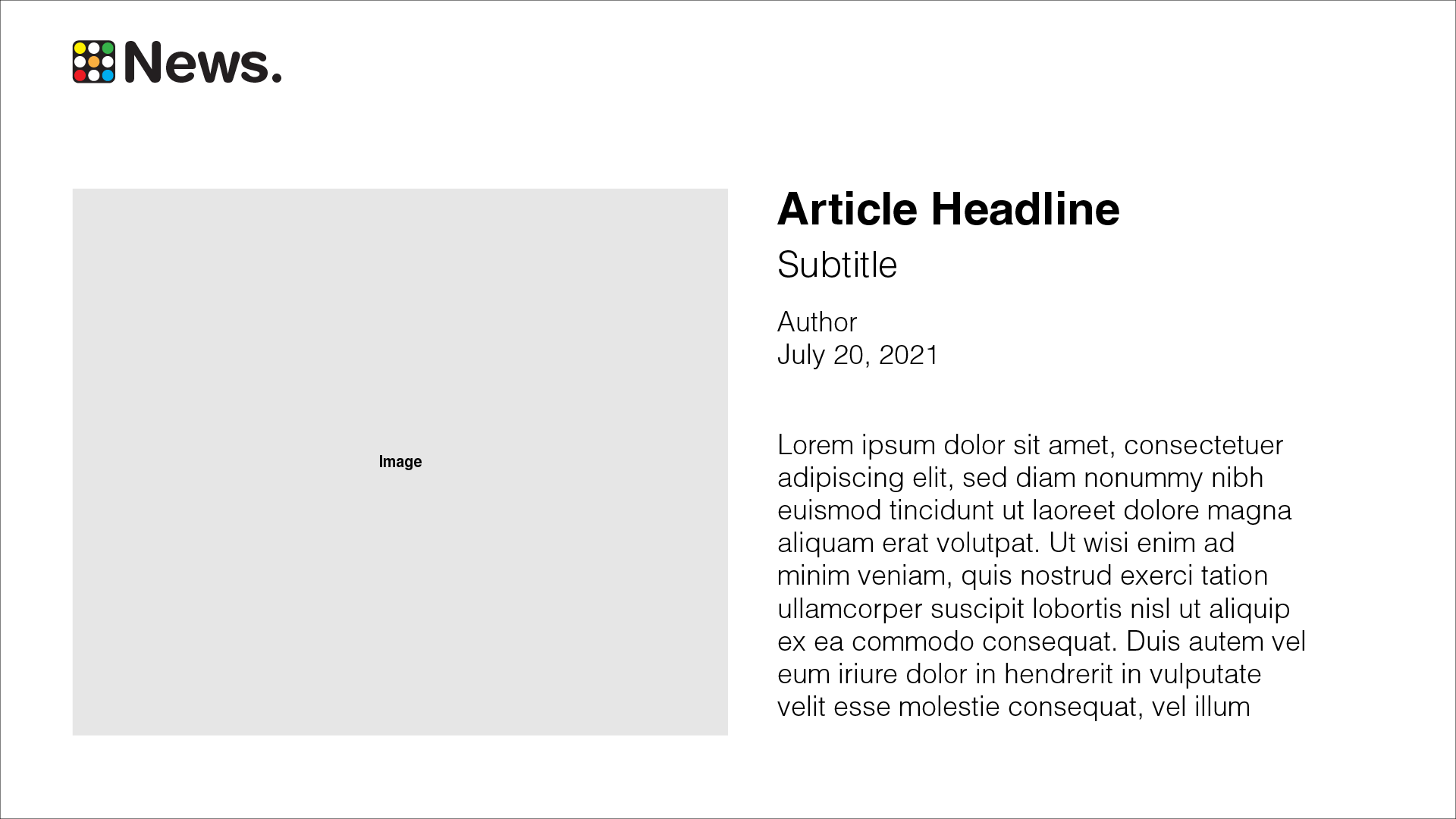
Each element in the Home screen can be selected and it takes the user to the Detail screen for that specific element. For example, tapping on the Traffic element takes the user to the Traffic details page. Tapping the Media Element, such as a News feed, takes a user to the list of News Feeds. For the News Feeds the user can navigate to the Content Details page to read or watch the media.
Weather Forecast Details Screen.
Calendar Details.
Markets Details.
Traffic Details Screen.
News Details.
Content Details accessed from News type of screen.
Settings & Front Door.
The settings screen allows the user to setup the correct account and sources from which the data will be displayed, as well as the presentation format for the data. Font door lets the user Login or Create an Account, if the user if new to the platform.
Settings Page
Front Door.
Final Designs.
The Final Designs are using a custom typeface, one of my personal favourites, Helvetica. This is not the default tvOS font – San Francisco, even though it looks similar to it. Using a custom typeface can set the application apart from the OS and create a unique experience to it. The user will feel they are using a product with its own identity and personality.
The main branding typeface is Helvetica Rounded. It is used in the logo, Content Titles and the Date in the upper left corner. The primary text font is Helvetica Roman, on some elements it is Helvetica Light.
The tvOS version of the Today App uses a dark, Vibrant, theme. The palette of the Today is pretty large. The application uses 7 main colours. The colours are consistent with the iOS version of the app, just a slightly lighter shade for improved visibility on the dark backgrounds.
The first 4 are the main branding accent colours, each corresponds to a different type of data the app presents. Blue is for Calendars. Orange is for Traffic. Red is for Markets. Green is for News and Video Content. This is consistent with iOS as well. For example, Markets are Red on both platforms.
The bottom 3 colours are used for text and backgrounds. The Blue-Black is for backgrounds, White is for Primary Text, Grey is for secondary text and Blue-Grey is for the widget background.


