Today iOS Application
Today application concept is a personalized advertising-based News, Weather, Traffic and Calendar aggregator. The application shows users personalized advertisements based on their habits and preferences and exclusive offers, available only for the users of the Today application.
The inspiration came from a local Toronto news tv channel which has a lot of information on one screen. Today does something similar, but with data relevant to the user, not just generic content. Today is an app a user can launch on the Apple TV or iOS device in the morning and see their entire agenda for the day at a glance. There is no longer a need to go to different apps or websites to see what will be going on particular day. Everything in one place, from Calendars, Traffic to News and Markets.
Specifically, the Today app features a main dashboard containing Weather, based on the user location or preferences, Traffic and Transit information, Calendar events, To-do list, News and Markets content from user preferred sources. The user can specify the sources from which they would like to receive the information in the app. The application also shows some light hearted content user can relax to.


The Logo.
The logo symbolizes the various kinds information the user can receive in the Today application. The coloured circles represent the approach of amalgamating different sources and kinds of data into one app. Where each Color represents a kind of content the Today app provides.
The Journey.
Paper Prototypes.
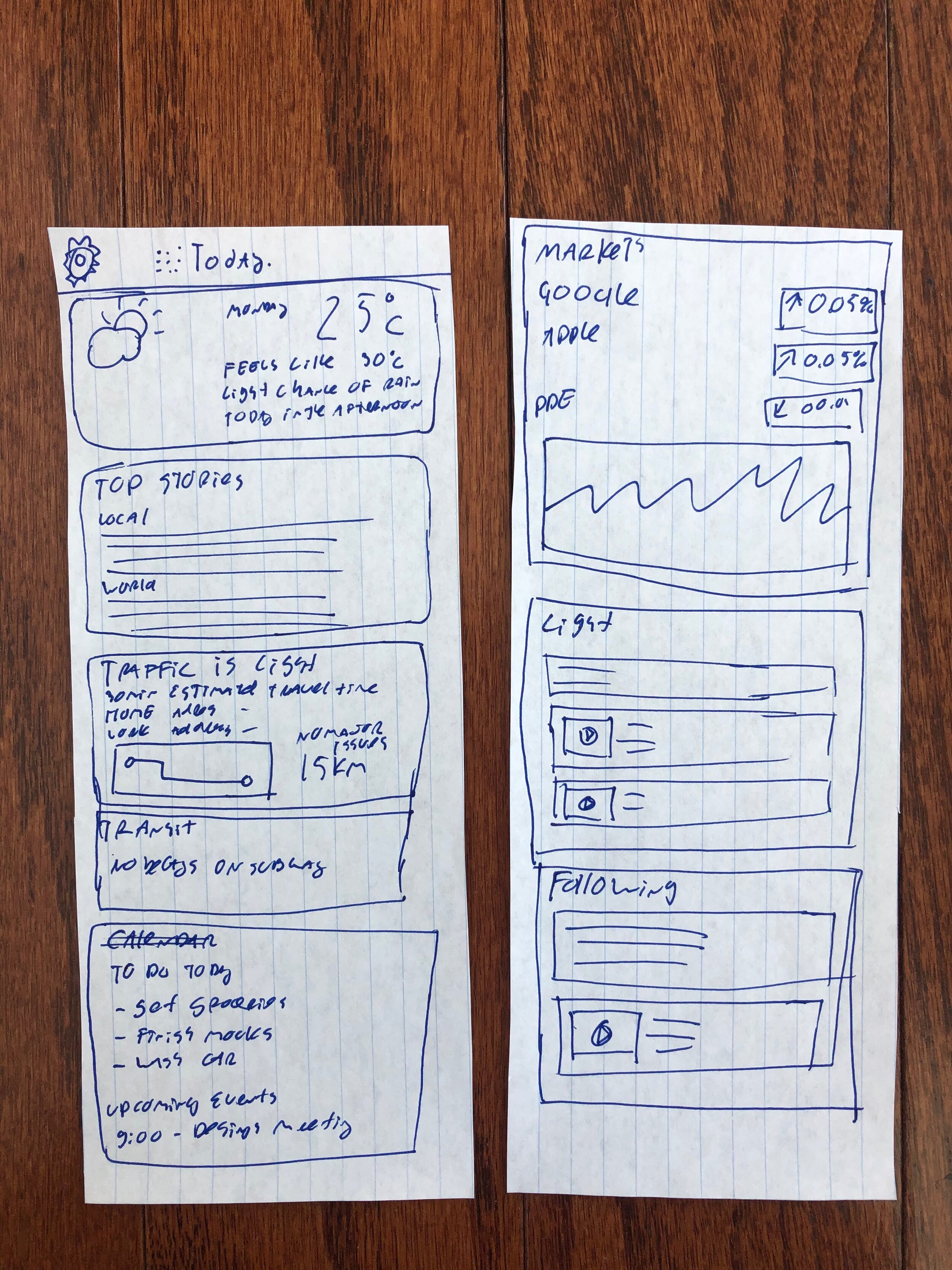
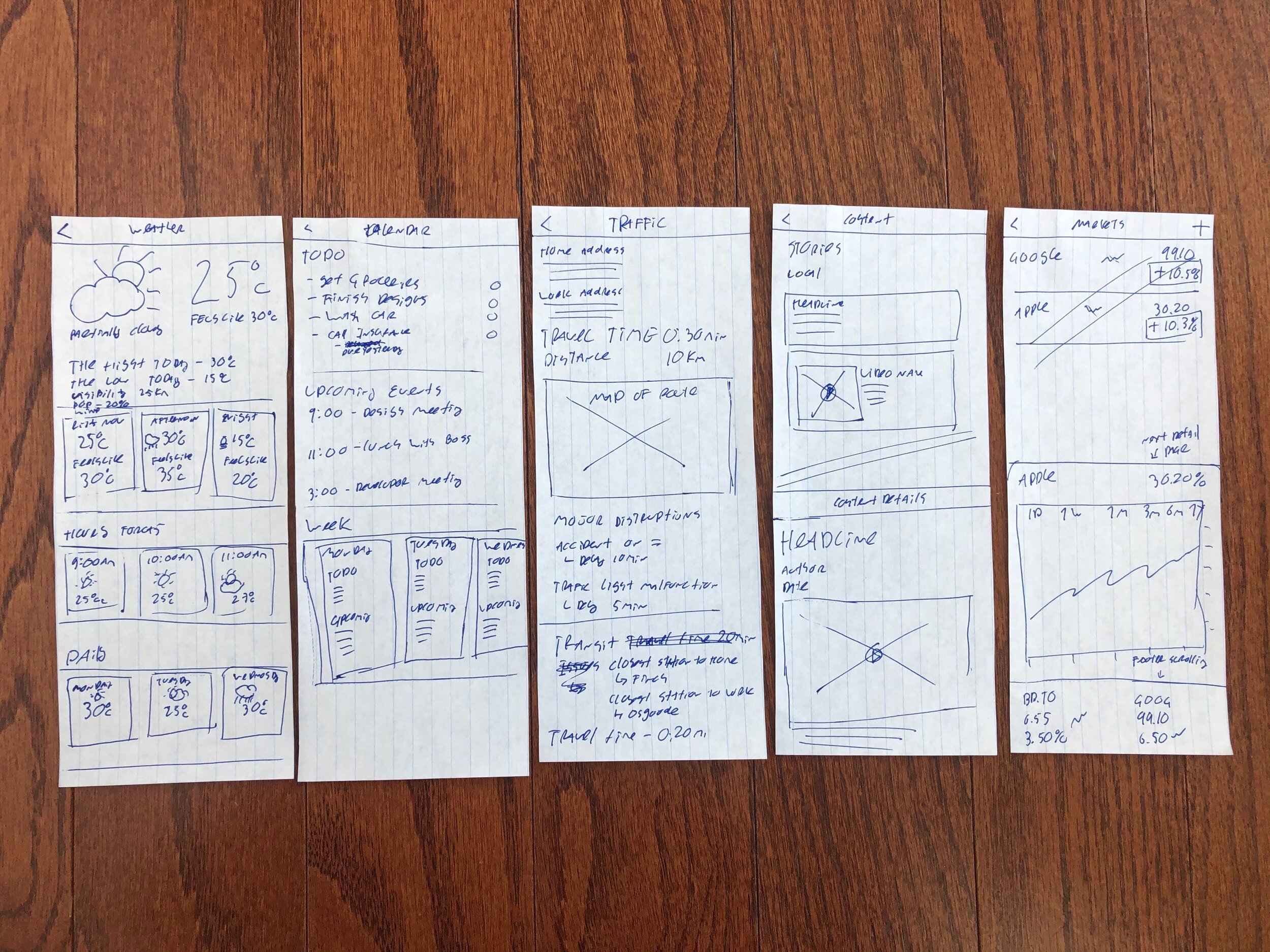
Like all of my design projects, the Today iOS app began with the creation of paper prototypes and sketches. This is a critical step, which helps me visualize and layout the interfaces without the complexities of computer design software.


Digital Wireframing.
The first step in the “Digital Design Process” of the application is creating simple, but complete, wireframes. The wireframes are meant to show the final layout and functionality. Logically, the wireframes need to look and feel like the final design. This means, all the elements and navigation items make sense and are in proper places. All inconsistencies of the paper prototypes have been identified and fixed. This however, does not mean that all final designs must 100% conform to the wireframe, changes can still be made.
The Home Screen.
The Today Application was designed to use very simple navigation. No tabs or complex modal views very used in the design. All the important information is right on the Home Page, everything in one place. The personalized advertisements and deals, not shown in this wireframe, will be placed in between the content. As the user scrolls down, they can see all the relevant content they have picked at a glance, from Traffic, Weather, Stocks to Personalized News and Light Hearted Content Feeds. If the user desires more in-depth information, they can navigate to the Details pages.
The top of the Home Screen. This is what the user sees when they launch the application.
As the user scrolls down, they see more different types of content. Advertising banners are either between the content or right in the Media.
Today Details.
Each element in the Home screen can be tapped and it takes the user to the Detail screen for that specific element. For example, tapping on the Traffic element takes the user to the Traffic details page. Tapping the Media Element, such as a News feed, takes a user to the list of News Feeds. For the News Feeds the user can navigate to the Content Details page to read or watch the media.

Weather Forecast Details Screen.

Traffic Details Screen.

News Details.

Markets Details.

Calendar Details.

Content Details accessed from News type of screen.
Settings & Front Door.
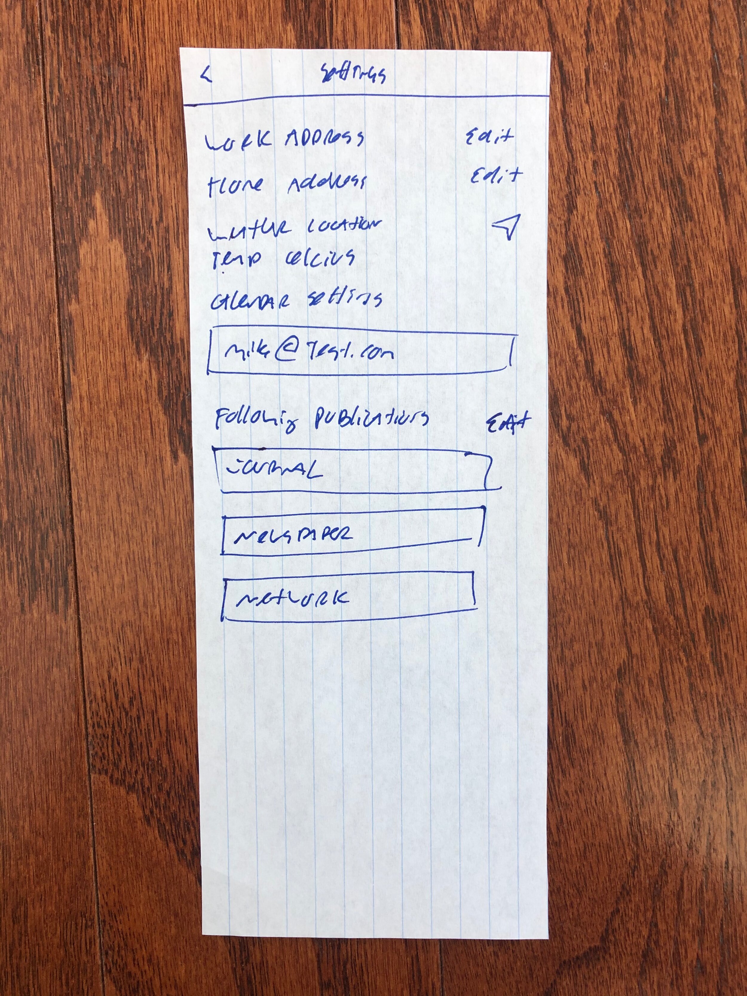
The settings screen allows the user to setup the correct account and sources from which the data will be displayed, as well as the presentation format for the data.
Font door does only two things. It either lets the user Login or Create an Account, if the user if new to the platform.
Settings page.
Front Door.
Final Designs.
The Final Designs are using a custom typeface, one of my personal favourites, Helvetica. This is not the default iOS font – San Francisco, even though it looks similar to it. Using a custom typeface can set the application apart from the OS and create a unique experience to it. The user will feel they are using a product with its own identity and personality.
The main branding typeface is Helvetica Rounded. It is used in the logo and the Navigation Bar date. The primary text font is Helvetica Roman, on some elements it is Helvetica Light.
The iOS version of the Today App uses a light, Vibrant, theme. The palette of the Today is pretty large. The application uses 7 main colours.
The first 4 are the main branding accent colours, each corresponds to a different type of data the app presents. Blue is for Calendars. Orange is for Traffic. Red is for Markets. Green is for News and Video Content.
The bottom 3 colours are used for text and backgrounds. The Black is for primary text, Grey is for secondary text. Light Grey is for the widgets background and White is the background colour of the app.


