Wavio iOS Application.
Wavio is a live streaming, music, radio and podcast application concept for iOS and tvOS platforms, it designed to be an "all- in-one" listening experience.
The iOS app is both designed and optimized for Live Broadcasting and active usage, while the tvOS version focuses on at home playback of Live Broadcasts as well as, conventional streaming. Each platform offers an experience unique unto itself.
The name "Wavio" comes from fusing the words "Wave" with "Stereo", and substituting the ‘e’ for an ‘i’. This is also a wordplay on the computing term “I/O” which stands for “Input/Output”.
The ‘I/O’ aspect of Wavio is showcased in the user being able to host their own live video or audio broadcasts, as well as being able to listen to, or watch broadcasts from other Users and Artists. Sharing live concerts, night club events or intimate living-room performances as they are happening - is now reality with Wavio.
Broadcasts can be saved and shared into Live Library for users who did not get a chance to experience them live.
The application allows users to steam audio online as well as downloading files and listening to them off the grid. The application features heavy use of recommendation engines and machine learning algorithms resulting in suggestions based on user listening habits and preferences.
The Wavio app allows users to upload the music files they already own. Personal files can be listened to offline, stored on device, or streamed directly from the cloud.
The music service caters to both regular consumers and picky audiophiles by offering different subscription tiers based on audio quality. Standard is limited to maximum 320 kilobits per second, this gives casual listeners a great quality, low data usage and lower cost. Premium is for hardcode music fans, for whom compromised sound quality just won’t cut it! The premium tier features both compressed formats for “on-the-go” listening and lossless files with unlimited bitrates for the Hi-Fi sound systems.



The Logo.
It all begins with an idea. I wanted to do something simple, but unique at the same time. The logo was sketched by hand first and then drawn in Adobe Illustrator using a grid. The letter ‘O’ is set to resemble an old-fashioned radio speaker. Since the ‘O’ is instantly recognizable, it is also featured on the iOS app icon
The Journey.
Experimenting with many different hand drawn sketches is an essential part of my design process.
It is easier for me to try different things with pen and paper, without computer software getting in the way of creativity.
Good software design should begin with pen and paper.
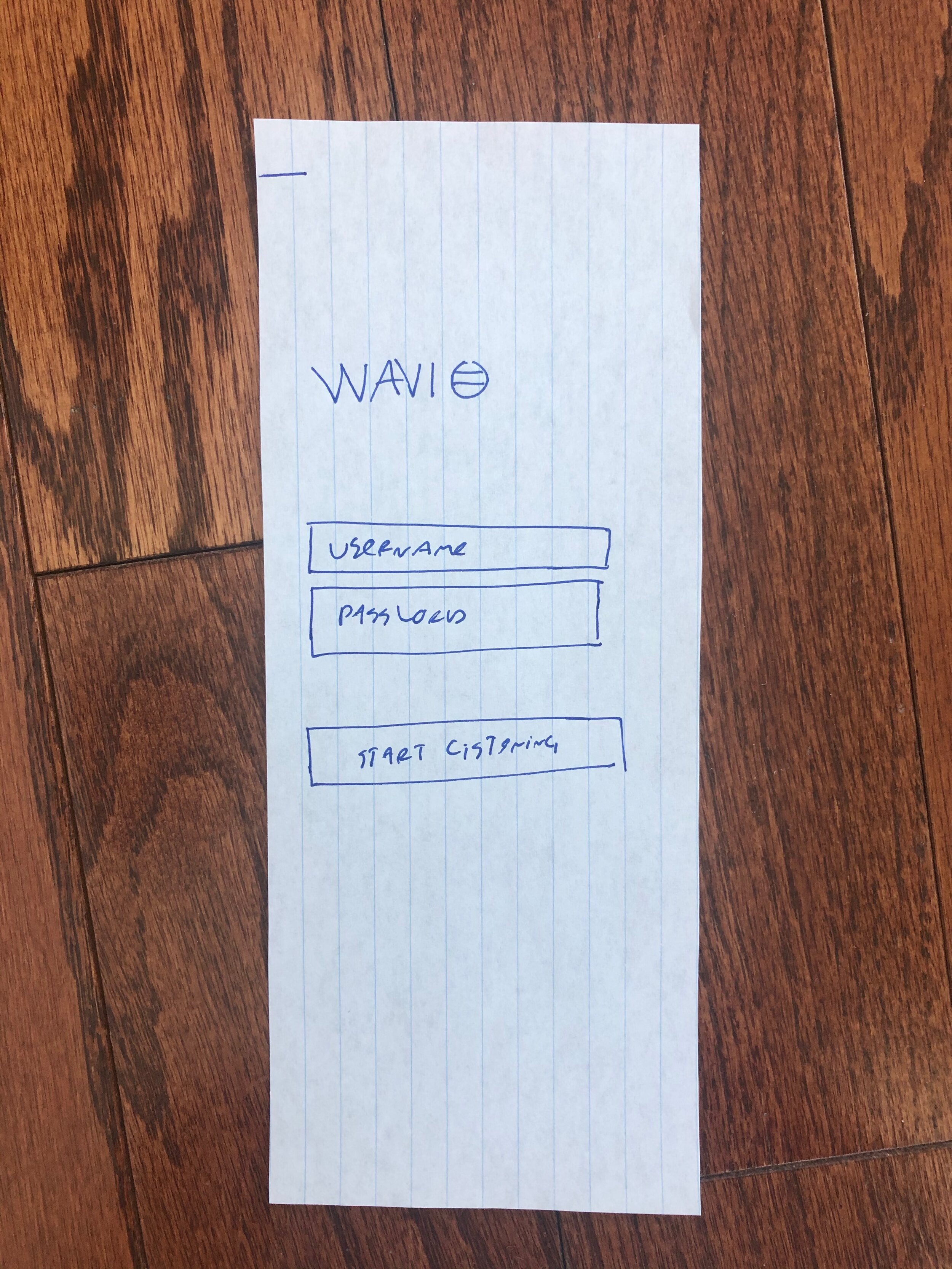
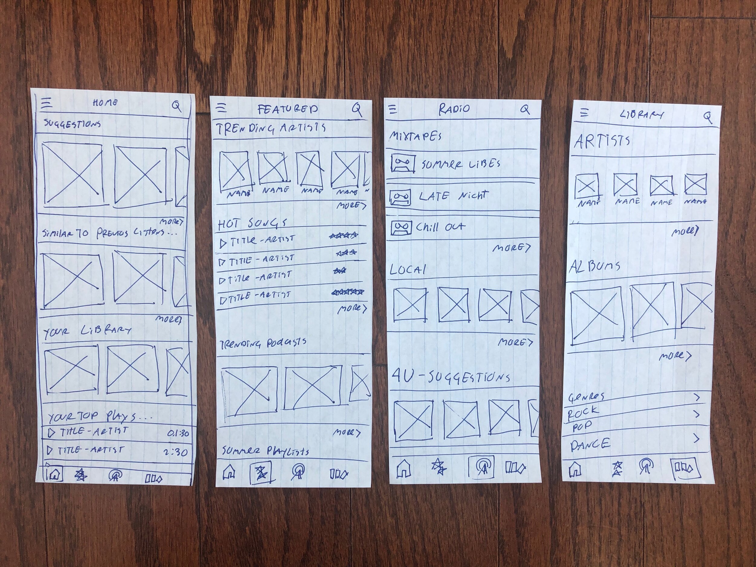
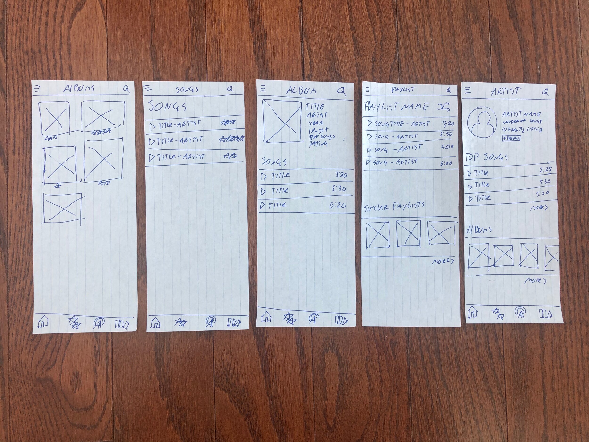
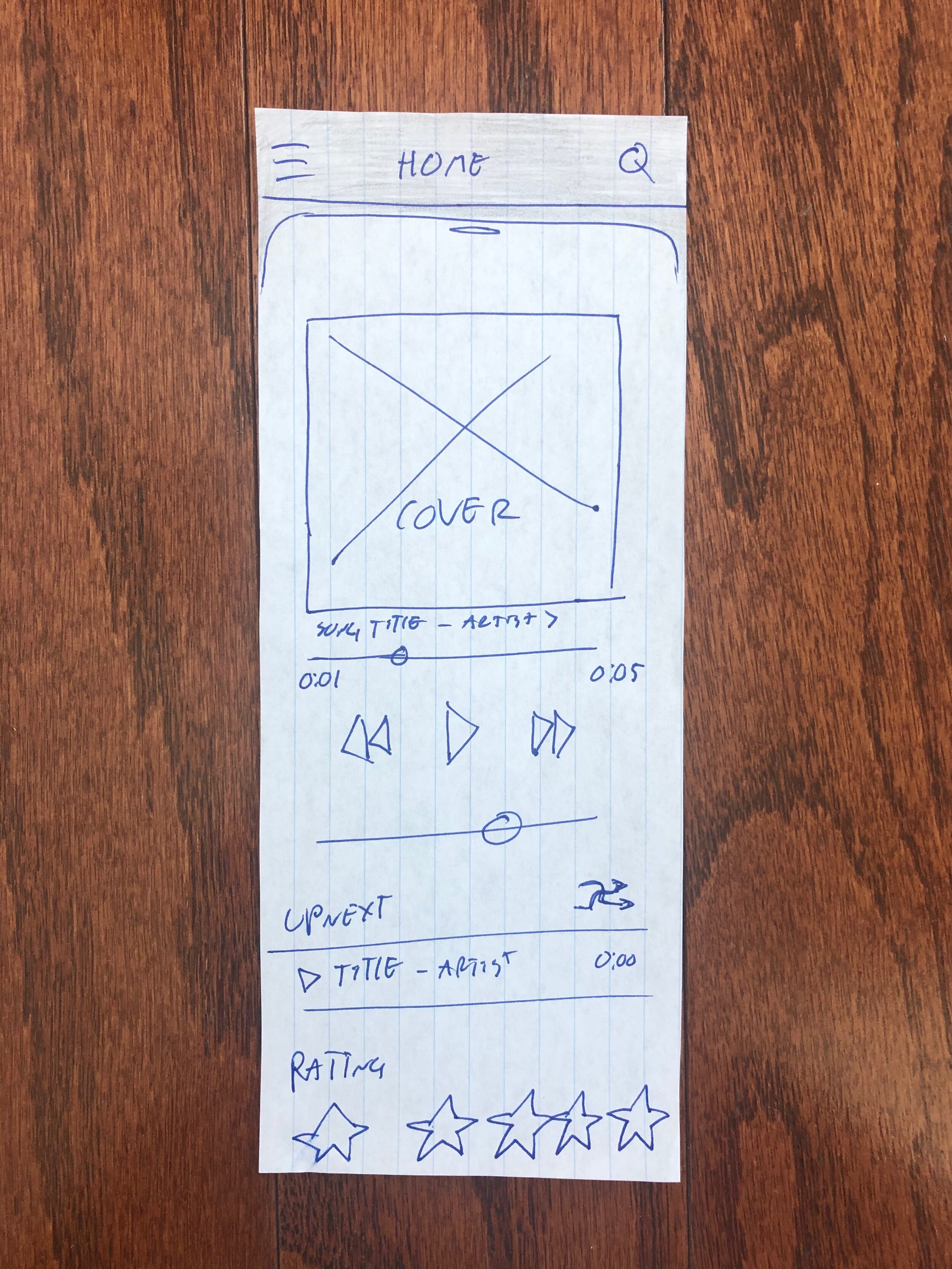
Wavio iOS app was no exception - and began its life as a paper prototype first. Rough paper sketches of all the main screens, help the app come to life.
Before leveraging any graphic design software or developmental tools - it is best to know what exactly one is about to do. The best way to figure out the look and feel of the application is though paper prototyping.
Cutting out the prototypes into shapes similar to the screens they will be on - helps visualize the end result. It helps to literally, hold the prototype in hand.
Digital Wireframing.
The first step in the “Digital Design Process” of the application is creating simple, but complete, monochrome wireframes. The wireframes are meant to show the final layout and functionality. Logically, the wireframes need to look and feel like the final design. This means, all the elements and navigation items make sense and are in proper places. All inconsistencies of the paper prototypes have been identified and fixed.
The 4 Navigation Tabs.
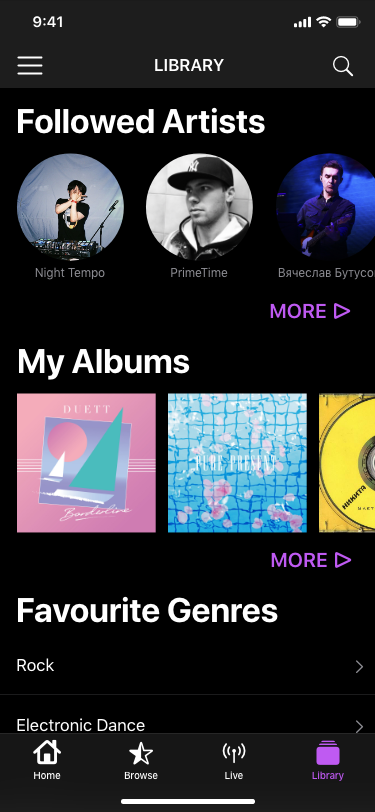
When apps have less than four tabs, they look empty and incomplete, while more than four tabs look cluttered and bloated. Personally, I prefer simple navigation on iOS, due to limited screen real estate. To me, four is the magic number.
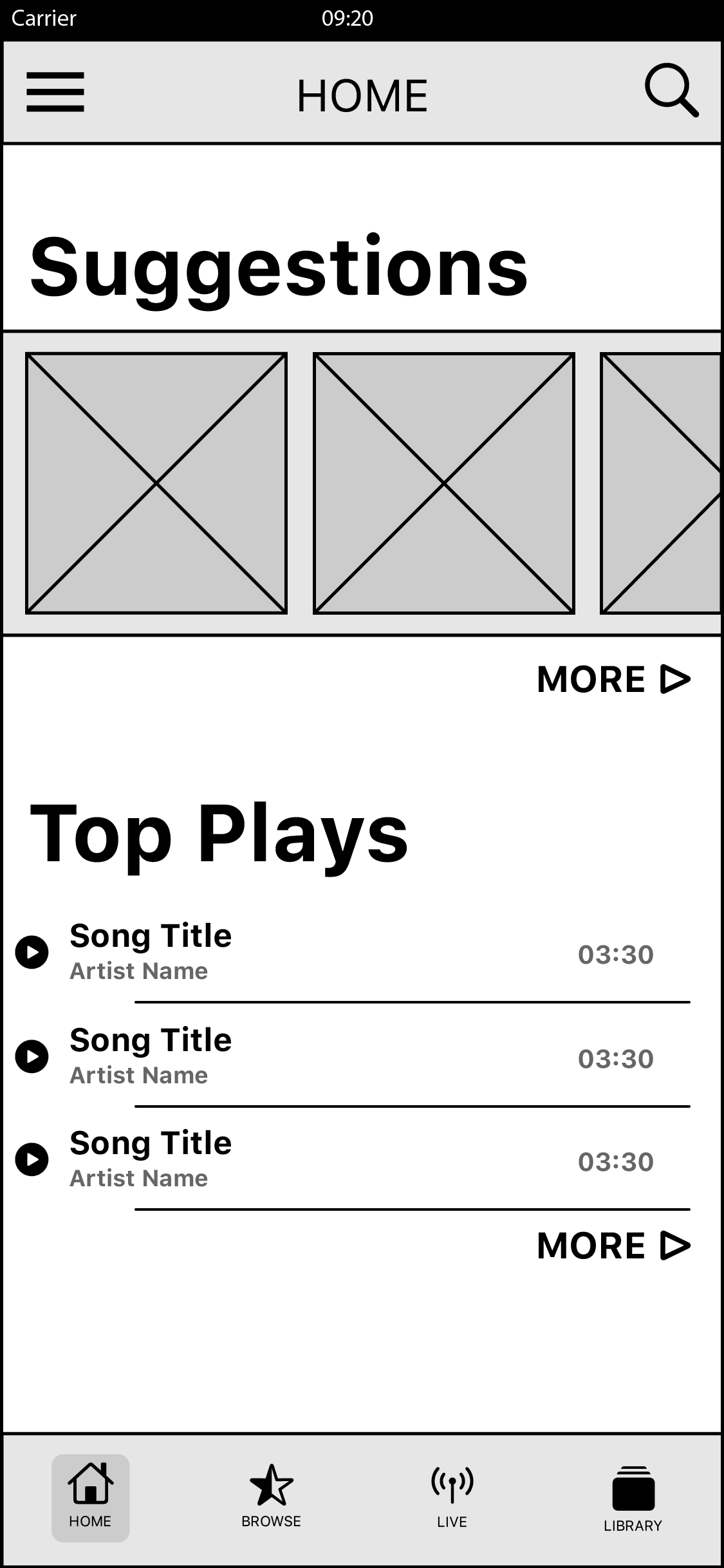
Home. Populated with the most relevant content to the current User.
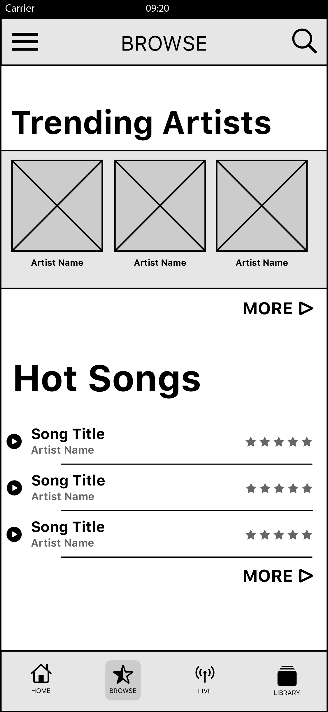
Browse. Populated by promoted and featured content based on User listening habits.

Live. Featuring the Call To Action to Start a Live Broadcast, Live Content, User & Artist Live Streams, Curated Mixtapes & Local Radio.

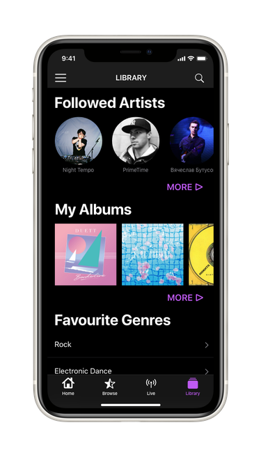
Library. Contains content saved and preferred by the current User.
Live Broadcast Screen.
This is where Wavio unique magic of sharing a Live Broadcast happens. The Audio or Video streamed from the iOS platform can be consumed on the mobile or ten foot platforms.
The iOS Live Broadcast screen lets the users see the live scrolling comments from others, as well as, giving the user the ability to comment themselves. Users can rate the Live content by selecting the stars at the bottom of screen. The video button in bottom right corner either enables the video broadcast or keeps it in audio mode only.
Detail Screens.
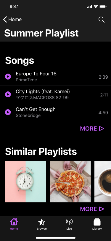
The purpose of the Detail Screens is to present all the available content for the selected media type i.e. Music, Podcasts, Artists, Albums, Songs. The Back button takes the user to the previous screen. Tapping the Tab Bar items taken them directly to one of the four main screens.


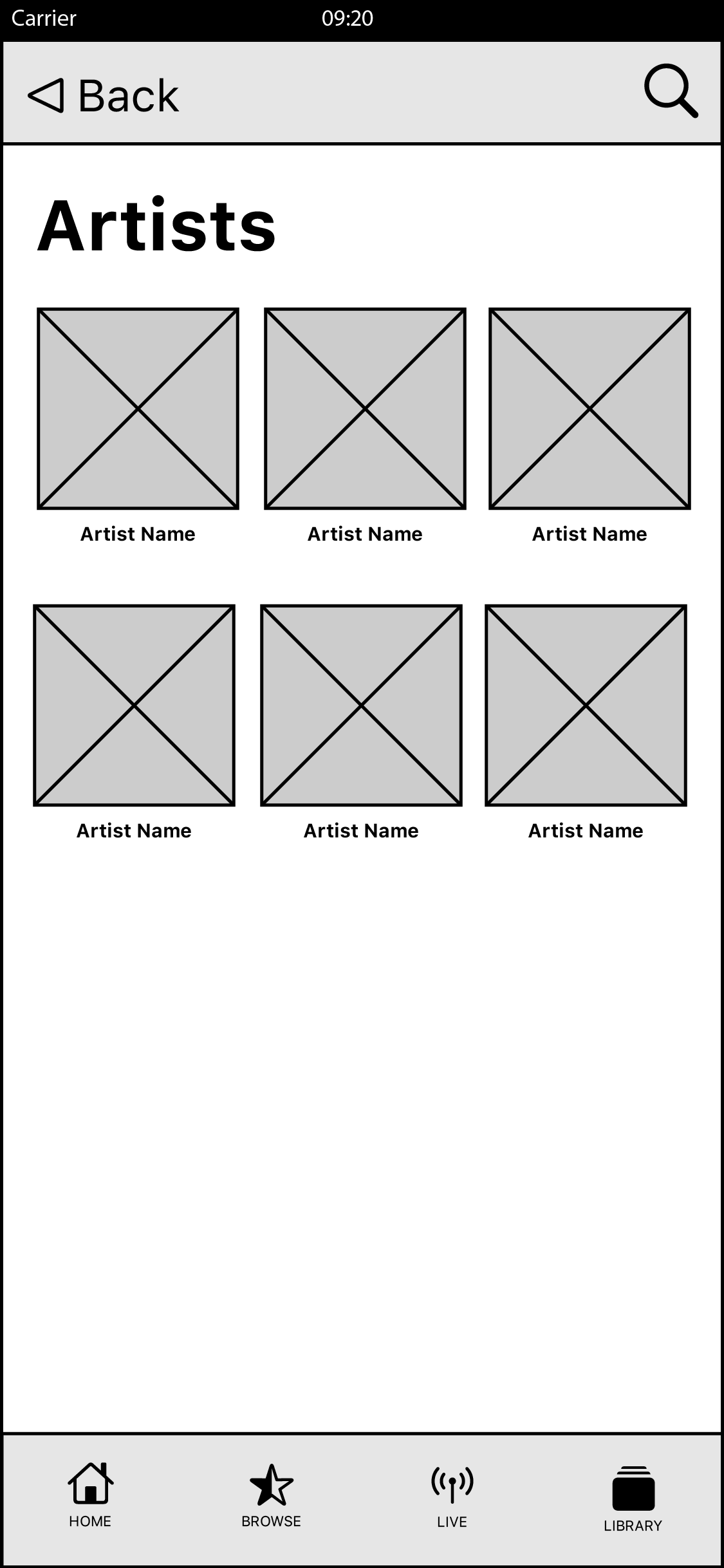
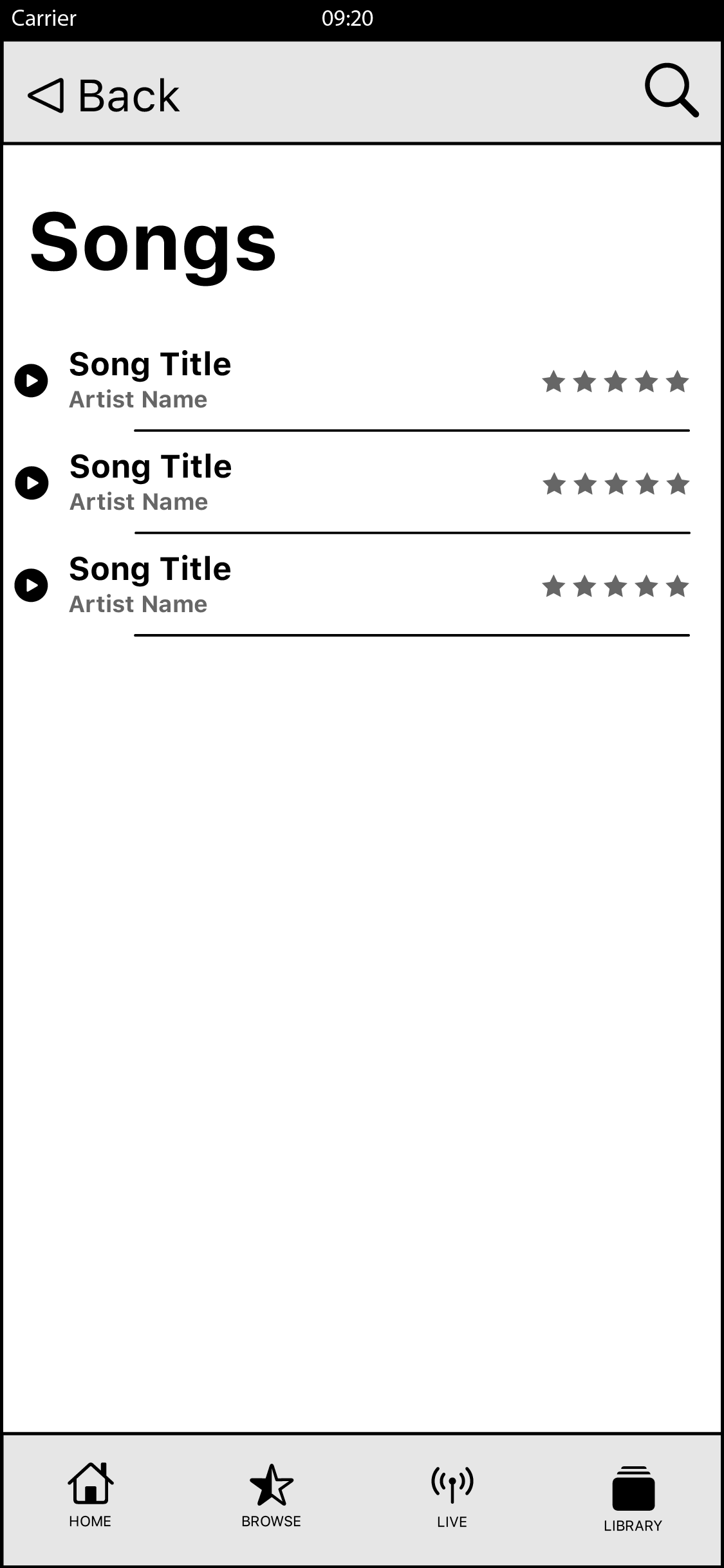

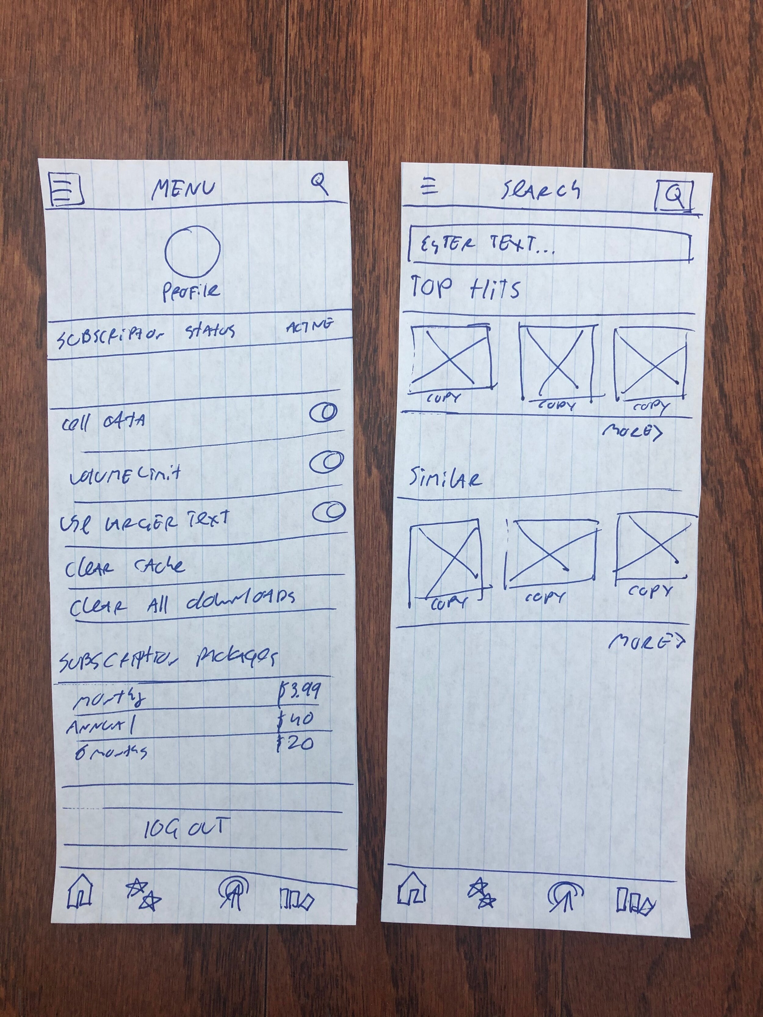
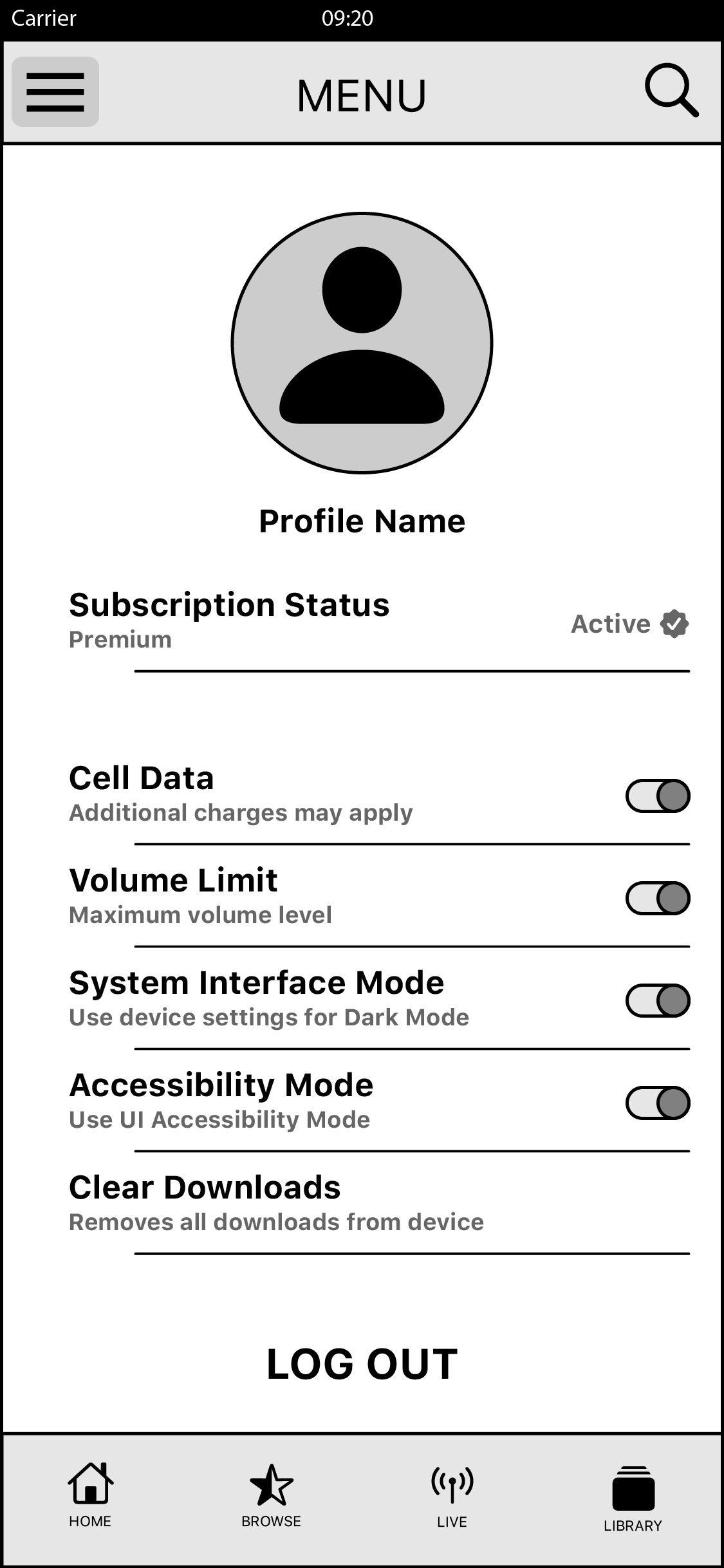
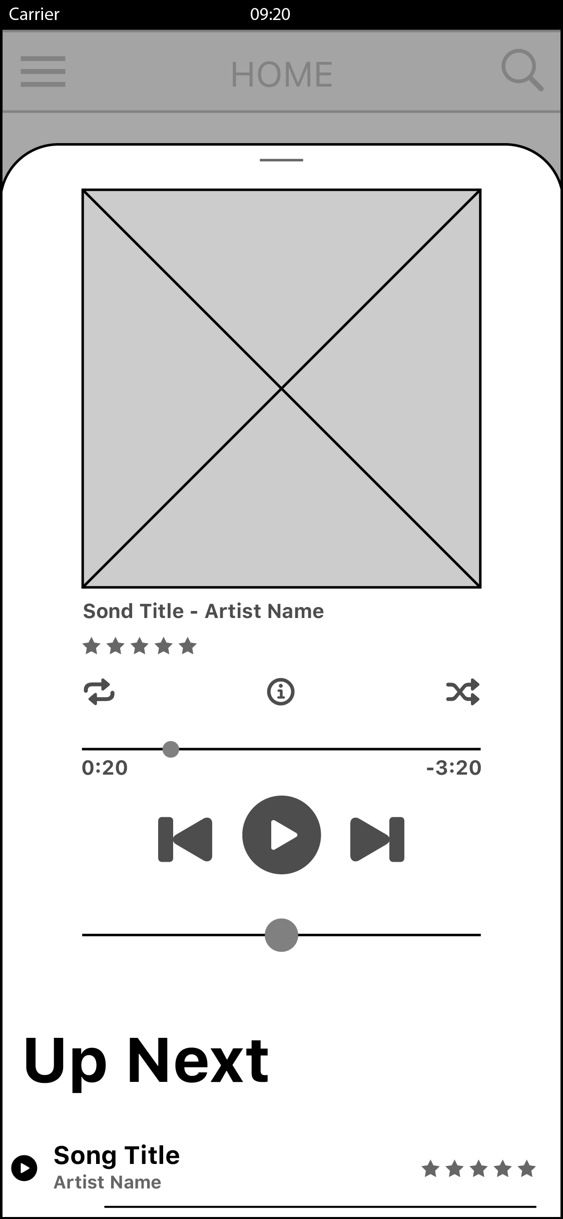
Menu, Search, Player & Front Door.
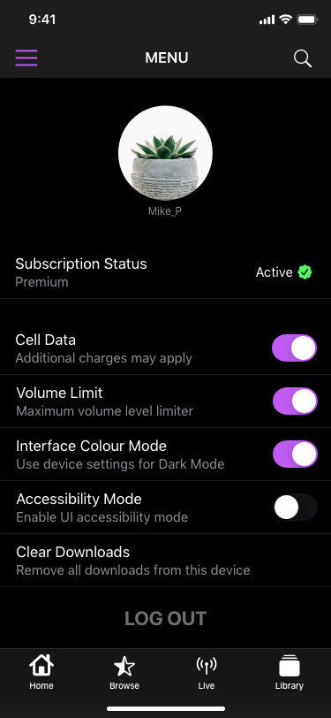
Accessed by the Navigation Bar buttons on the Left and Right of the Title. Left Menu item is for the Application Settings and the Right is for the Search Screen.
Menu Setting allows the user to see and modify their Subscription, Account and App preferences.
Search screen allows the user to search for content; it provides relevant and similar content in the results.
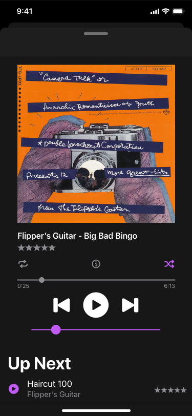
The Player is arguably the most important screen in a Music application; thus, it has to be the most thought out. Wavio’s player has all the necessary information and functionality right at hand; from the play controls, to song information, to rating, to the up next and play order controls.
The Login Screen is clean and simple. It has to be. It does only two things, asks the user to enter credentials or to subscribe, if they do not have an account.


Final Designs.
The final designs use the Apple Human Interface Guidelines suggested typefaces and text styles. The iOS default typeface, San Francisco, is recommend by Apple to use for all applications. I have decided to follow their recommendations, since the platform owner has optimized the UI elements to work with this typeface.
The same goes for the Icons. I have used the SF Symbols libraries provided by Apple. These icons are rendered as characters and are great for iOS and tvOS use because they provide seamless integration with the UI elements and ease development.
These are the 4 main colours used in the application. Black is for Backgrounds. White is for Primary Text and non-active Call to Action elements. Grey is for secondary text and elements of lesser importance. The primary branding colour is Purple, it is used on Primary active Call To Action Elements and most important elements.


